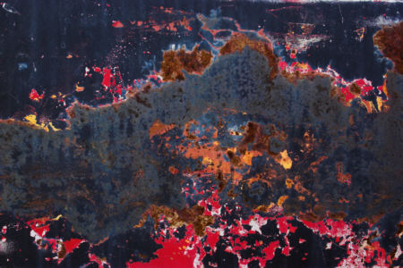
I just returned from a short trip that, as it turned out, provided the opportunity to revisit some previous locations and subjects. It was interesting to notice what I found interesting this time around, what I did differently, and whether there is any direction apparent. Today I’ll focus on the color abstracts in my ongoing Patina project, which is based on surfaces of junkyard vehicles and weathered rocks.
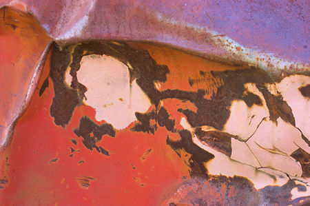
I hadn’t planned a junkyard visit, but I ended up sleeping out next to one, and I photographed there the next morning. In addition to images like the one above — photographs of more or less flat surfaces — I found myself looking for places where different surfaces came together in an appealing combination. The image below is from a crumpled body that weathered quite differently on different orientations.
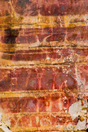
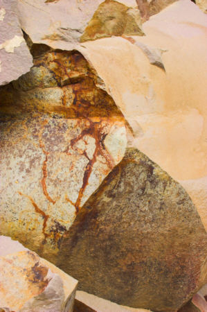
Later in the trip I stopped at a rock face in Yellowstone at a pass known as the Golden Gate. I’d been planning to photograph the rock varnish there ever since conceiving the Patina project. Again, I made some photographs of flat faces, including the one above with a minimalist feel (reminiscent of Rothko?) But I also expanded it to include a more irregular patch next to it, resulting in a much more complex image (Jasper Johns flag?)
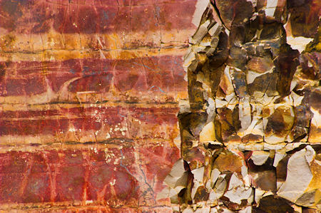
Although the possible trend I see here is towards complexity, in fact the new-style images mostly involve only two or three different areas. I’m thinking of this more in terms of the areas “talking to” each other, along the lines of Sean Scully’s idea of disharmony. I like the contrast in the “flag” between the horizontal stripes and the broken, pointy “stars.” Maybe I should reverse the image left to right to strengthen the suggestion?
Another image from the same rock face makes me think of a paper collage.
Where do your tastes fall on the simple – complex continuum? Do pictures you like tend to be towards one end or the other? Does your preference extend to other arts, like film, literature, or music?

Great pictures, Steve!
Even though I liked every picture, my favorite was the last one. It has a collage transforming to a painting feel with the sienna playing tricks on you. Very nice.
I like the batik-like feeling of #3
Steve,
These have a very Japonisme feel to me — I’m trying to sort it out. Partly it’s the batik-ish that Birgit mentions (shibori and batik are forms of the same processes and effects).
Other thoughts — while the last one is simple, it also has depth and movement, as does the second one. Both seem very different to me from the more mottled pieces.
As for complex–simple — I think I like them both, particularly at the outer ends. In the middle, I tend to focus on other things but when the complexity/simplicity is extreme, it grabs me.
PS — how did you come to be sleeping next to a junk yard????
Ummm … saving money by sleeping in a bag off the side of a side road. The water bottle froze solid.
These images are great. I was more drawn to them after hearing where you were photographing. At first glance i thought they were paintings. There is a fantastic mystery in the textures.
I immediately thought of Jasper JOhns when I saw your “flag” photos! Great work, Steve.
Steve,
You are embracing color!
YOW!
Steve, can you go 16×20 on the first? I want a print. How much?
(Yes. I’ve been away… doing music.)
Rex,
You’re lucky in your taste: I can offer color at a lower price, since I’m selling only black and white at the gallery. (I also won’t sell this series in Montana, to avoid infringing on the turf of an excellent local photographer, Tom Ferris, who inspired me in this work.)
I can go only to a print size of 12×18 myself, but there is a good printer here I can work with for larger prints. If you mean a size to be framed at 16×20, I usually mat at 10×14 for 3″ borders, or 12×16 for 2″ borders, but print uncropped and let the buyer choose what’s visible (which might change). Prices are subject to change, so I’ll email details to you. Thanks for the query!
Rex, does the image fit your music? Consider it for the CD cover…
I meant 16×20 printable area. I didn’t know if your source could go that big and still stay sharp, sharp, sharp.
And yeah, what a knockout look for a cd.
I’ll catch you on the email for details.