Posted by Birgit Zipser on November 30th, 2007
Germany is celebrating Paula Modersohn-Becker (1876-1907), an important representative of early expressionism, on the 100th anniversary of her death. From 1906 to 1907, she painted nude self-portraits, at that time an unprecedented opus by a female painter.
Her work inspired me to compare female nudity seen through her eyes in 1906/07 to those painted by males between 1918 and 1570 – Modigliani, Gauguin, Renoir and Tintoretto.
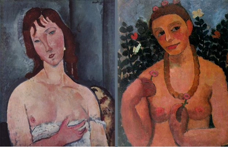
I. Amedeo Clemente Modigliani (1918) Paula Modersohn-Becker (1906) more… »
Posted by Sunil Gangadharan on November 29th, 2007
Anita Shapolsky gallery last month hosted a very eclectic exhibition titled ‘Writers who paint’. Among others, it had under its purview artworks by accomplished writers like Jonatham Lethem, Jack Kerouac, W. B. Yeats and Aldous Huxley. I thought the idea was a very cool one, firstly, you had insight into their minds through their writing and now you could explore their paintings, drawings and other objects of their visual imagination through the lens of the individual’s written words. It is precisely for this reason that I think that the artist blogs are a new form of a self-portrait that an artist can develop temporally…
Of course, some of the few art blogs that seemed to cover this event seemed to think otherwise. The comments were very telling of the age of specialization we live in and what happens if we transgress even a little bit from our supposed spheres of expertise.
“Writers should stick to their areas of competence”
“Writers doing art results in art that is just not good”
“More bad art strung together upon a theme”
“Cult of the celebrity in overdrive”
“While you can accidentally take a good photograph, it takes years to become a good photographer”
While I think that the wisdom of the online crowds is a marker for the current times, reading some of these comments gives one a view that unless one is specialized in the arts (like an art degree or is a full time artist), there is a danger of their art being perceived as inferior to full time artist. What happened to the age of renaissance men and women who could dabble in multiple fields and excel at many of them? Are the lanes leading that great town called Specialization getting so narrow that only people with the right calling cards and pedigree are offered entry at the appropriate tavern houses along the way?
I am most interested in your comments.
Weldon Kees, ‘After Hours’, Oil on canvas, 33″ x 43″
Posted by Steve Durbin on November 27th, 2007
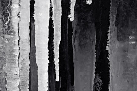
Winter is now here, having held off till mid-November. Last weekend I headed in to Pine Creek Falls, hoping to find an entrancing combination of ice, snow, water, and rock, as I had last year at this time. That’s when I had the first inklings of waterfalls as a potential subject. As I gear up for another round with Jay, attempting to come to grips with what that subject means to me, it seemed a good idea to return to the source.
more… »
Posted by Jay on November 24th, 2007
Let’s try for those images again.
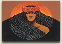
Pele representation
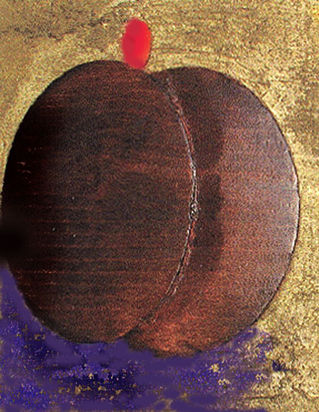
Carved Pele in fruit mode.
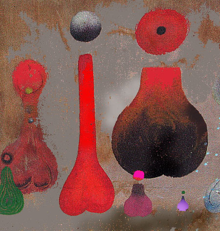
Pele perfume bottles
Sorry for the inconvenience
Posted by Jay on November 24th, 2007
For this last year I have been a Project Learn volunteer, helping Leon brush up on his reading skills. I have doodled during lulls in the sessions. Recently, my idle scratchings revisited an old compulsive tic. Some twenty years ago I stumbled across one of those holes in the fabric of existence that I have often felt a need to patch. I discovered that Pele, the Hawaiian goddess of volcanism, was visually underrepresented in traditional Hawaiian art. Since then I have gone so far as to attempt carved wood and plaster visualizations, along with paintings, all of which I have thrown out.
I began to wonder, while scanning these doodles into the computer, how they might be worked up in Photoshop. Here are some results. But before showing these, I would like to review a few Pele things.
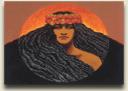
This painting is typical of how Pele is visualized these days: a volcanically-adorned woman, or a tableau depicting an episode taken from her narrative. I have tried to treat Pele in a more symbolic way, pulling together “woman, island, lava and symbolic depiction” as more or less geometric constructs. A parade of discards testifies to my great success.
more… »
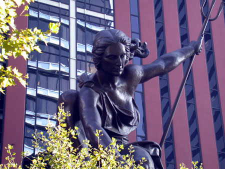
Posted by June Underwood on November 23rd, 2007
Probably because I grew up in the careless and tasteless 1950’s, before Lady Bird pointed out that the landscape was filling with garbage, but after logging and poverty had been pretty well trashed my neck of the woods — that is, because I had a visually impoverished childhood — I find living in this city a continuing visual delight.
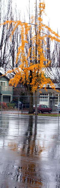
Even the rain has its moments.
So I thought for as a bit of thanks-giving, I would meander around Portland Oregon, pointing out the sights that I like. Some of these are constant public presences, like the statue of Harvey Scott in Mt. Tabor Park. Scott was a city “father” as well as an anti-suffragist newsman. (I keep scheming of ways to bring his perfidy to the attention of the city mothers).
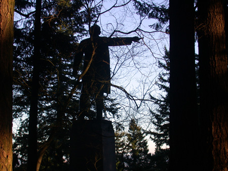
 more… »
Posted by Sunil Gangadharan on November 21st, 2007
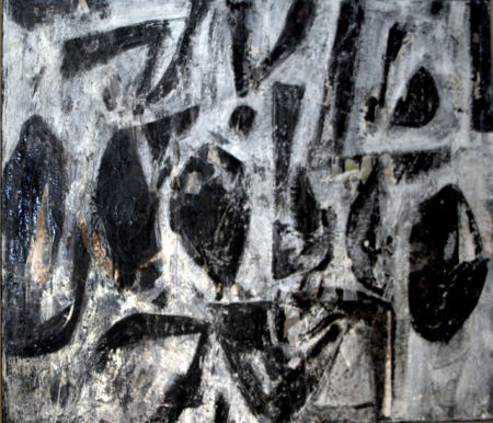
While I had always harbored an unexplained inclination towards abstraction, it is only recently that I have started to explore this form a little more in detail. Part of the exploration involves trying out hitherto untried (at least by me) combination of materials on masonite. Here are two paintings that I attempted recently using a combination of wet gesso, Indian spices and acrylic.
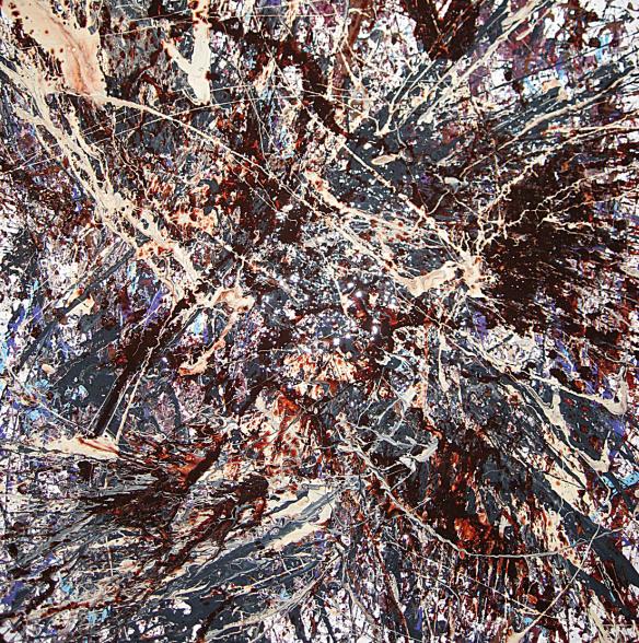
Sunil Gangadharan, ‘Untitled_111007’, Acrylic, Indian spices, latex based housepaint and gesso on dricore, 24″ X 24″
To achieve the dynamic effects and an impasto finish, it was imperative that I work wet on wet – which also meant I could not mull too much on the outcome, just add the colors and the paints as relevant and then stand back and ponder the results…
Pure abstraction is somewhat akin to nature, random interplays of relevant forces that yield unpredictable patterns, moods and feelings.
At certain points during creation of these paintings, I felt some of these interplays intensely.
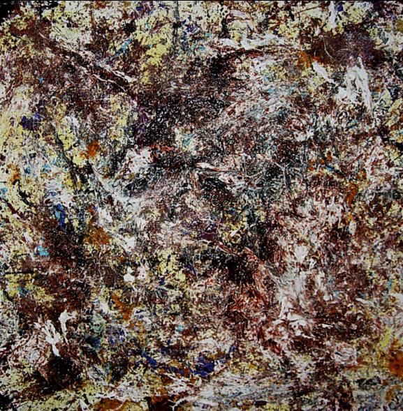
Sunil Gangadharan, ‘Untitled_111707’, Acrylic, Indian spices and gesso on dricore, 24″ X 24″