When it comes to created work, most artists have little choice but to move on once they’ve produced a piece (admittedly, it can sometimes be difficult to identify or reach an endpoint). Photographers are blessed or cursed with a real choice. Probably most, having once achieved a satisfactory rendition of an image, are willing to leave it there. From that point, with digital technology, endless identical copies can be made (I’m ignoring printing technicalities, a different subject altogether). In the non-digital world of printing from negatives, a new print request may entail a repeat visit to the darkroom, but careful photographers certainly have notes on paper choice, development time, and any dodging or burning they might have settled on. Reproducibility is one of photography’s greatest strengths, despite the headaches and posturing over pricing that it may induce.

I just recently got my long-down printer up and working, and printed some requested images that I hadn’t looked at in some time. I find I can’t look at an image (especially one of mine) without thinking about it, and thinking about it often leads to ideas for potentially improving it. This is all the more true when I’m evaluating a print, which affords a much richer experience than viewing on a monitor.
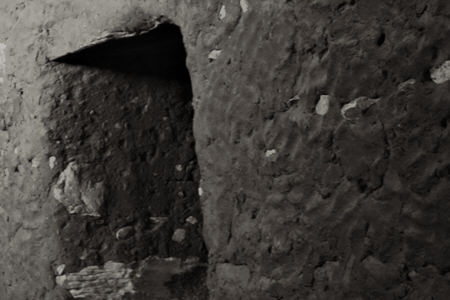
The image above, showing a thousand-year-old Anasazi site on the Colorado plateau, is one of my favorites for its strong graphic qualities. Unfortunately, the high contrast made it impossible, with my camera and a single exposure, to capture good information in both the darkest and lightest areas. To show detail across the brightness range that the eye is easily capable of, I had to combine two images, made with different exposures for that very purpose. This can be tricky to do well. The bright triangle of cliff face at upper left, seen in detail below, has to convey the intensity of the outside light in comparison to the dimness inside. But I also wanted enough contrast within the bright part (which requires some less bright shades of gray) to show the zig-zag tail of a snake design fortuitously visible in the upper corner. (I should have set up more carefully to include more of that design. Next time!)
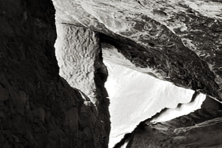
Besides adjusting that area to improve it from the previous version, I also worked on the contrast in the darkest areas, which is harder to appreciate on the screen compared to the print. I wanted to strengthen the sense of solidity of the wall on the left, and also bring out the still-visible finger marks in the daubed mud of the dwelling facade. This poignant detail, well preserved because of the cave setting, really took me back to the time I was exploring there, and on to further musings about the former inhabitants.
Another image I just printed is from my Sourdough Trail project, which I’ve mentioned here before. The photograph below always struck me as a little odd, particularly the somewhat jarring juxtaposition of the very smooth bark of the left-most tree and the very rough, dark bark of the larger one next to it. In the past I printed this with both trees quite dark, but this time that felt like too strong a contrast with the dawn sky and sunlit leaves. Lightening the darkest tones brought out more detail and enhanced the tactile differences between the trees. But I decided that was a gain, and I also discovered that the lighter and smoother patches within the rough bark developed a silveriness that linked them with the smooth-barked tree.

So despite regrets for what I couldn’t change, I found real enjoyment in re-visiting these images, and in re-visiting in my mind the time and place they were captured. I think I also learned something artistically from looking at them with a fresh eye that will help me make better captures and better prints in future. In principle, I could have gotten these benefits without actually changing the prints. Yet in practice, without the ability to make tangible improvements with relative ease, I probably would not have analyzed and experimented and learned as much as I did.
I wonder whether this “lucky” capability of digital photography makes artists in less malleable media jealous. On the other hand, it could be said that having this option inhibited me from achieving a better, more finished result at first. To the extent it allows laziness, I think it’s a curse. I guess ultimately, I cannot reject the opportunity to re-visit and revise without having to re-start from scratch.

I love your dancing trees and foliage. They bring yesterday’s hour of Zumba back to my mind. I would love to have a print.
I reprocess my photos all the time, being at a very early stage of AP experience.
Birgit,
It sounds like I caught you in a weak moment. I hope dancing always leaves you so expansive! If you still want a print tomorrow, email me to arrange size and other details.
Steve,
Is it always the case that dark areas reveal far less detail than bright/white ones, particularly on the web? I often have this problem with showing stitching on photos of my art but thought it was ignorance,not the nature of the media. Of course, as I think of it, the washed out versions get tossed instantly while the ones with areas that are too dark are often not obviously flawed.
Yourlast photo is a gem — the light not too diffuse nor too bright, but just sufficient for the luminosity among the trees to set Birgit to dancing.
In the earlier photos, I was struck by the combination of the natural cave and the artifice of its human structure. Your photo captures that as well as wide range of values. Perhaps there’s a metaphor for you. At any rate, it strikes me that you are thinking as the photo and its potentials direct you, which is very psychogeographic.
I am suspicious of the term “laziness” — I think that the tools of the digital age simply allow artists to go deeper and further because they aren’t up to their armpits in chemical solutions. In some sense it democratizes the processes that only the non-chemically sensitive expert could indulge in in earlier times. Of course, “democratizing” can also mean dummying down. But never in your case — it simply means you work both at gaining greater originals but can also reexamine and rework the materials at your leisure.
June,
My father who was up to his armpits in chemical solutions died of cancer at a much too young an age. I am so happy that we can avoid that in the digital era.
Steve,
The photograph… always struck me as a little odd... Is there a message there? Is the Difficult, Unusual and Odd a precious gem that needs to be cut?
Reading about designing books and ordering pictures into sequences, I am struck by the wonderful juxtaposition of the images here, spirits of the dead with spring foliage.
Birgit,
You have a good point. Anything that stands out for some reason in my mind has a better chance of being interesting for someone else. The woods picture would be more classically balanced or conventional without the smooth-barked tree, perhaps too much so to be worth more than a passing “oh, that’s pretty” attention. Perhaps my feeling that it was just odd was an unconscious recognition that it was really about the two trees as much or more than the dawn sunlight. At least, that’s what I was beginning to think while re-printing it, and more clearly through this conversation.
Steve,
Recently, I enjoyed looking at some breath-taking pictures illustrating whirling motion at http://www.auspiciousdragon.net/today/index.php?showimage=498.
But I am more drawn to the interplay of foliage and tree stems/branches in your photo of the forest. What are my susceptibilities – appreciation of texture, serenity, playfulness, subtlety, incandescence?
Also, my not very successful attempts last summer to capture trees and foliage tell me how precious this picture is.