Posted by Steve Durbin on March 30th, 2008
An article in Wired magazine, Frame That Spam! Data-Crunching Artists Transform the World of Information, introduces several artists who transform found data into artistic creations. Their craft lies in the choice of data source to operate on, and the construction of an algorithm that manipulates the data to give results that are aethestically pleasing and/or conceptually interesting.
The art could be three-dimensional, as with the creations of Alex Dragulescu, though his objects are, as far as I can tell, not actually constructed, but merely rendered as images.


more… »
Posted by Jay on March 30th, 2008
As I’ve said before, It’s a matter of doing things indoors while waiting out the season.
A few tentative results have come up in the interim. One is a bundle of gender symbols composed of walnut, mahogany and oak pieces that I’ve had around since I dressed as a younger man. The other is a serendipitous product made up of mason’s lath, a basic building material that I ran across at the hardware store.

These pieces are intertwined one circle through another to form a closed loop. Again, this is changeable as the mutual relations of the pieces depend upon which individual is picked up or hung on the wall. Makes me think of a story whose narrative, and the outcome of which, would depend upon a given word or paragraph being chosen in a programmed context. more… »
Posted by Birgit Zipser on March 28th, 2008
‘The right aspect of a web page has a stronger impact on our mind than the left aspect’ is a notion adopted by the advertising world, as I recently learned from one of Steve’s comments.This made me look at the real estate on the web.
For safety, I recently switched to gmail because I lost all my archived email from my apple mail box after innocently agreeing to update the mail box.
Let us look at one of my gmail threads:

more… »
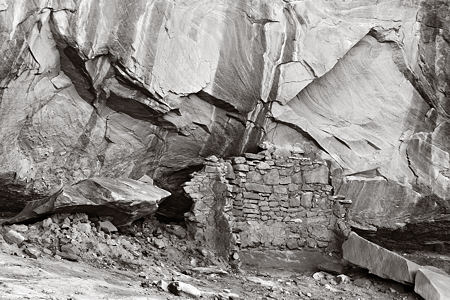
Posted by Steve Durbin on March 26th, 2008
I’ve just returned from a trip to the Colorado Plateau, my third since getting my camera. The canyon and mesa landscape is amazing, but most of my interest lately has centered around the ancient remains of human habitation, and their relationship to the landscape. I’ve focused on the small settlements and structures, and haven’t even been to larger sites like Mesa Verde in many years. My reasons: the small ruins are not on maps, there are no crowds, and the hiking and searching for them is a large part of the enjoyment.
more… »
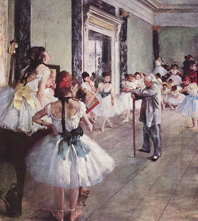
Posted by June Underwood on March 20th, 2008
Recently I visited, twice, the Portland Art Museum’s current exhibit: The Dancers, featuring art by Degas, Forain, and Toulouse-Lautrec. Both times I was struck by the marvel of organization that the curators had achieved.
The exhibit begins with an overview — art by the three men — and then proceeds to explore each individually, moving from Degas to Forain to Toulouse-Lautrec. Degas is first, and of course, his dancers are superb. Beside them, in the overview, Forain’s painting of a dancer seems a much lesser image, although the subject is somewhat more personalized. And Toulouse-Lautrec work seems more about shape than about a subject matter — at least in the initial exhibiting area.
more… »
Posted by Steve Durbin on March 18th, 2008
Francis Bacon wrote: “There is no excellent beauty that hath not some strangeness in the proportion.” Just recently, by one of those common coincidences, I’ve seen this idea compellingly expressed in different contexts, though both related to art. One is the passage below from a Laurie Fendrich interview, which I had occasion to quote in a comment elsewhere.
The beauty in abstraction comes when abstract painters create marks, shapes, forms, and colors that tap into unseen but universal, psychologically beautiful forms and shapes. The marks and colors, since they range so widely in painting, bring to abstract paintings the poignancy of the individuality of each human being. I said I’m almost a complete Platonist, but I’m not a complete Platonist. I think deviation, or falling away from perfect form, is what makes something profoundly beautiful. Perfect beauty is different from profound beauty; the latter is always partly tragic and has something wrong with it, always, and without exception. The “something wrong” part is the handedness, or the individual way a painter paints, which points to the fleetingness of our lives. But it’s really simpler—beauty either is or isn’t, once a painting is done. If it knocks the socks off someone who sees it, and that someone is a deep and sensitive person, that’s the test. Period.
more… »
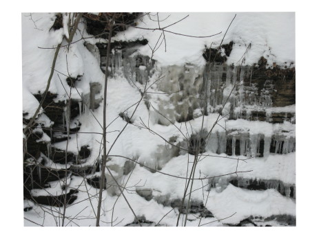
Posted by Jay on March 15th, 2008
Steve wears out skis in pursuit of his prey and I hardly leave the pavement. These are record shots, essentially, but they have a certain something.
The foreground twigs are a web cast upon the ice. more… »