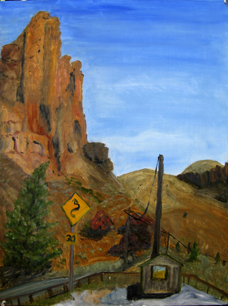
The Clarno Palisades and Ranger Station, John Day Fossil Beds National Monument, oil on board, 12 x 16 , May 2008
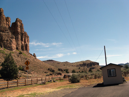
The Clarno Palisades and Ranger Station, digital photo, May 2008
I am having trouble finding time (and intellect) to discuss the particular mental discussion I have been engaged in over the last couple of weeks. However, if you check out to position of the little building (the ranger station) in the photo above, and compare it to the painting, you may see something of the perceptual question I’m pursuing.
Of course, I’m not pursuing these perceptual quandaries all on my own. Rackstraw Downes, a contemporary urban landscape painter from the UK who graduated from Yale alongside Philip Pearlstein, Chuck Close and others, has taken up the query and worked out various ideas about what we empirically perceive. Downes’ art and his intellect play with his empirical knowledge of linear perspectives, versus what we’ve been taught we perceive. He maintains that our book learning on perspective is based on architectural renderings (as well as the studies we know from the Renaissance). But empirically, he says, what we actually see of the world of apparent verticals and horizontals is very different.
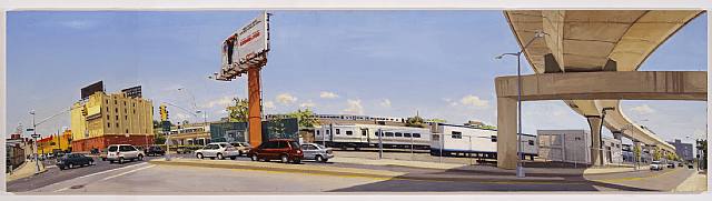
Rackstraw Downes, Atlantic Avenue At The Entrance To The Van Wyck Expressway, 2007, Betty Cuningham Gallery (click image to enlarge)
Downes paints, in Robert Storr’s words, “the surface of the earth and what rises from or cuts into it….Virtually all of Downes’s paintings are horizontal. The vast majority are strikingly elongated.” (from Rackstraw Downes, Sanford Schwartz, Robert Storr and Rackstraw Downes, Princeton Univ. Press, 2005, p.61)
By and large, Downes’s paintings are very long and narrow — typically one might be 12″ x 40 inches or 18 inches by 94.5 inches. He also paints wide horizons on panels that are exhibited next to one another. So he’s a master at seeing what happens when the artist is planted in a specific spot, painting, and turning her head to either side to pull in the wide horizontal view. “As I turned to my left, without moving my feet, the verticals began to tilt: the more I moved the steeper they tilted…. The positions and movements of the body as the the artists looks and works are factors that are implicated in the way space is perceived and depicted.”
Downes is, as he says, an empiricist, and when he began painting representationally (he started out as an abstract painter) he tried to paint what he actually saw. And what he saw was that a wide horizon, say 100 degrees, will appear to tilt inward in the foreground and downward and back as the ground moves further back. Looking upward at structures that are at the corners of our vision will make those structures also appear to tilt inward.
These “tilts” are not generally accounted for by classical theories of linear perspective (the monocular converging railroad tracks) but they are what someone like David Hockney confronts when he photographs as horizontal scene from a variety of viewpoints. Things don’t look “right” in his photos, but we are hard put to comprehend quite why.
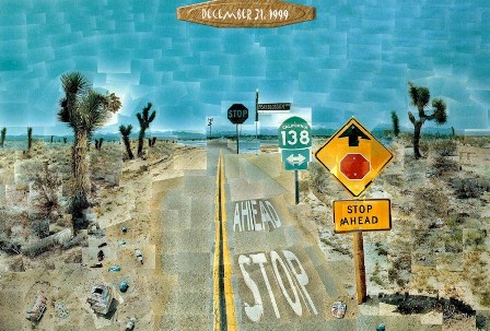
David Hockney, Pearblossom Highway, Photomontage, 1986
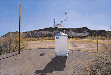
Rackstraw Downes,Water-Flow Monitoring Installations on the Rio Grande near Presidio, TX 2002-2003 (5 parts. Part 1: Facing South, The Gauge Shelter, 1.30pm)
The painting I did last weekend is a case in point. In the painting, I used a vertical viewpoint and, taking artistic license, pulled the ranger station close to the rock base so it would fit on the board that I was using. But the photo, taken at the widest angle my digital camera lens provides, shows something of the skew that a painter might perceive if the support were much longer and could encompass both the ranger station and the palisades.
The skew is one that anyone who photographs structures will recognize as being a result of the camera lens at a wide angle — fish eye views are the extreme of this. In the photo, the building tilts inward; empirically speaking, in our single-position eyeball-view as well as in a camera’s lens, foregrounds curve in as they are seen on left and right (Rackstraw Downes, p 129); then they move out and down as the scene moves to the middle ground.
I was unaware of the photo-eye view of this scene until I finished the painting and off-loaded my images. But I automatically corrected for it in my much narrower “view” of the landscape.
A good article and interview by David Cohen with Downes can be found on Artcritical. The book called Rackstraw Downes, cited above, with essays by Sanford, Storr, and Downes, has marvelous photos of Downes work as well as interesting classical examples to bolster his theoretical stance.
These perceptual conundrums raise interesting questions; does the horizon appear to curve in various directions because of the spherical nature of the eyeball? And where does the curve begin and how should it be attended to in painting? And what about photography — should the parallax (is that the word?) be corrected for by the photographer? Interesting questions.

June:
As I wag my finger I say;”But there are no “shoulds” in art.” The artist tilts according to his leanings.
I was surprised to learn that the eyeball is defined as an extension of the brain. Why this is not also the case for the ear I do not know. The light that hits the retina is a mess, the product of a bad lens set in a less-than-spherical ball, and the brain applies its own sophisticated mechanisms to create the straight lines and clarity of image that we experience.
But now that you mentioned it, the door edge to my immediate left does seem to be leaning backwards
Jay,
About the ear — it is also an extension of (or warped by) the intellectual units of the brain. Remember how the Rites of Spring caused riots (of horror and dismay) in Paris the first time it was publicly performed. A year later, it was perceived as a masterpiece of construction and invention. The brains of music listeners adjusted.
However, I think you are right that the eye is more fraught with ways to be influenced by what we are taught. And that door edge of yours that slopes — well take a gander at “The Artist’s Son” (c. 1885) by Cezanne. His corner also slopes and I doubt it’s about the sinking of the building.
I got interested in this because I had learned that important perspective concept was that verticals are always perfectly aligned with the edges of the canvas. But when I painted, I found I had to refute what I was seeing in order to adhere to that kind of geometric standard. I was mightily relieved to hear that it wasn’t just _my_ cockeyed vision that was interfering with correct perception; it was the cockeyed way ma nature made vision!
June,
This is a topic that I have been struggling with since I took up photography, about a year ago now. My photographs from the Lake Michigan seashore have such different feeling than a sketch that I made of the same scene.
I am grateful that you introduced us to Rackshaw Downes. I will study his work.
As an aside,I also love a picture by Pierre Etienne ThéodoreRousseau:The Village of Becquigny 1857-1864, in the link that you gave us. The road is almost in the middle of the picture, instead of discreetly placed with respect to some ‘third’ of whatever it is called, that photographers recommend.
Only a short greetings from an internet café in my German hometown, fatigued after an all night flight.
I need to test this out more carefully, but I’m not sure your description of this perceptual effect quite matches my own impressions. If I attend to it, I do become more aware of convergence of vertical or horizontal parallel lines with distance. For example, before a large window or a building facade, which we tend to automatically think of (i.e. “see,” and then draw or paint) as rectangular. But the convergence makes it into a fat rectangle, bulging at the sides.
I think we’re dealing with the same problem cartographers have in representing part of the Earth on a flat map. The Earth’s surface is spherical, like our perceptual field around a point (our eyes–I’m ignoring their slight separation). To represent it on a sheet of paper entails a choice of projection. It’s not exactly a distortion in that it does represent what we see from a specific viewpoint and viewing direction (imagine holding the sheet of paper out and drawing lines where light rays from lines in the scene to our eye intercept the paper). But parts of it do look different from what they would if we viewed them more straight-on, i.e. turned our head (while also turning the paper to keep it perpendicular to our line of sight). Hmm, not sure I described this very clearly…
Birgit,
I have liked Downes work for a long time, but hadn’t read any theory by or about him until recently. I was most appreciative of his written description of what brought him to his theory because I’ve always had trouble with linear perspective.
Hockney first enlightened me with his writings about classic monocular static perspective and how we can’t see a classic photographic/architectural perspective unless we close one eye and fix our heads in a vise.
Downes upgrades that information for me and really brings me closer to understanding what I’m faced with. Once understanding is available, it’s easier to make choices.
I’m glad you found this interesting; let us know if you have further thoughts (after you’ve recovered from jet lag, of course).
Steve,
I definitely agree with you about “choice.” And if I’m understanding your experiment with your piece of paper description correctly, I agree there, also. There are more views than one that can be asserted as “correct.”
Classic perspective is monocular — remember the famous drawing of the artist with his head in a vise, figuring out foreshortening, etc.
That perspective was reinforced with the advent of the camera, which is single lensed, and even though the camera view curves at the edges when it is working at a wide angle view, we’ve all been taught that that’s an “error.” According to Downes, Ansel Adams specifically addresses this in “Making a Photograph” and tells how to correct for it by “use of a swing back.” Downes says, “BUt why does Adams call this entirely normal and natural phenomenon a distortion? Though this is not how the building really is, it is how it really looks.”
There’s nothing wrong with the corrected view of views — they are important for architectural drawings, for example. But they are merely a useful convention, not what we generally perceive in actuality. Downes calls this an “empirical” view, which may be an overstatement, since empiricism might also demand correction for science/measurement sake. But I understand what he means — which is that the evidence of our eyes report various kinds of curved space.
Another Downes quote: ” I don’t find that I see systematically. I –we– have erratic, not to say subjective, reactions to size and scale; we do all kinds of things when looking: we shift our attention, turn and tilt, quickly or slowly, get interested in some parts and uninterested in others. The process of looking — especially the process of looking while making a drawing or a a painting — is far too alive and spasmodic to be rationalized.”
By the way, Downes does a kind of experiment similar to yours: “I held up a long-handled brush at arm’s length to establish a true horizontal…, and I tested the apparent tilting against this.”
I think that just as Cezanne taught us that tilting the table up to see all its objects could provide a fresh and interesting take on the still life mode, Downes is insisting that painting what one actually sees as opposed to what one ought to see might be refreshing.
I was able to get the Rackstraw Downes book at the library and have enjoyed the looking I’ve done so far. One thing I find very appealing is his predilection for non-traditional landscapes (like you, too, June), for example underpasses or excavations or vacant interior spaces in the city, and roadsides, ditches and the like in the country. The perspective distortions are not systematic; if they were, there would be consistency across the picture plane. But there are a number where the tilt angle of the verticals varies irregularly in different structures, as if each is painted from a different point and angle of view, a sort of mild cubist effect.
One thing that I notice that is happening in the Rackstraw Downes paintings is the use of the vertical(line/object) in the (more or less)middle of the composition, an indicator for the point of view/focus of the artist´s eye;the same thing in david hockney´s composition which doesn´t happen in June´s painting; (this isn´t a criticismas I really like your work) but just to point out that one thing that might be bothering you June, about your compositions, in general is this lack of attention to the vertical refernce point.
We feel a vertiginous lack of stability in any photo or painting that has no mooroings to a cretain tradition or an accepted convention of ¨reality¨, verticals are vertical, and horizontals are horizontal. One can be ¨off¨ but when both are off if it gives a strabge sense of reality/vertigo etc…
*strange
Thanks, Lynne, for your observations. I will check through other Rackstraw Downes’ images to see if he always uses a reference point in that way.
I don’t think this is an issue in my own painting — it doesn’t work very strenuously with the Downes’ “empirical” observations because it doesn’t push the horizon out much. The photo does, of course, but it’s just for reference.
I sense that Downes would say that the convention is what distorts reality and that the sense of vertigo one might feel when faced with his work is really only a cultural by-product of having our “true” senses distorted by photography and Renaissance ideas of perspective. I’m just speculating, of course.
It seems indeed that Downes almost always includes strong “verticals,” mostly of buildings, in his cityscapes. Not rarely it’s an actual pole not too far from the center.
One thing he says in an essay in the book I found especially interesting:
yes I agree absolutely. And what we personally find interesting in a subject, whether landscape or whatever, what we focus on, is our personal ¨take ¨ on the subject, and then of course there are the wonderful magic things that happen , the rocks to the side In June´s painting, become more compelling, and therefore are larger than in ¨real¨ life, and hence more compelling , create an emotional effect (of some sort) whether completely consciously or not, but that´s the magic quality of making art too.
An easy-to-see example of the bulging I was trying to describe (comment 4) is in today’s NY Times. Pop up the larger checkerboard image and put your nose close to the screen. But it’s not very great if your head is still–it gets huge as you are moving towards the screen. Fascinating article.
Steve — Thanks tons for the reference. I checked out the first image example and noted that it took me a tad of time to see the bulge. So my brain is compensating for its compensation, perhaps?
It’s evidence indeed of why visual art is eternally fascinating and changeable. “Representative” art only represents a tiny fraction of the possibilities inherent in any given scene that might be encountered.
You raise some very interesting and complex questions! I’ve looked quite a bit at Downes’ paintings, and have read his descriptions of his process.I believe the curved horizontal elements in his work are simply the result of his turning his head! He takes an extremely wide field of view, and must turn both left and right to see those portions of his view. Looking right you’ll find that horizontals beneath your eye level rise as they are further to the side….and horizontals above your eye level drop. Same as you look left. So…to put both views in a single painting one must connect the sides with a curve.
As to the leaning verticals…I think they result from turning the head, in which case the head must tilt, and verticals appear to lean.
An old rule of linear perspective is that it works for a small angle of view…and you cannot (!) turn your head……or look with both eyes!
In the Hockney collage all the polaroids were shot pointed in a slightly different direction…there are as many view points as photos. Like doing a slow and careful visual scan of a scene. Hard to imagine applying this to painting! We do take in a view looking in many successive, slightly different, directions. But in painting we cobble these all together to match the whole model we hold in our head of the scene.
I have a sense that in your painting above you have re-constructed the image, greatly compressing the horizontal space….I agree that the lean of the vertical shack and phone pole is a result of the wide angle lens.
An extremely interesting thing about Downes practice is that he spends weeks at these sights, slowly building the complex image. BUT…it is painted as if seen at a very precise time, with extremely consistent light and weather. So….he must be exerciising an incredible memory and an also incredible ability to re-construct the structure of the lights and shadows! This seems to be seldom mnetioned, and is a fascinating aspect of his work. It also means that many aspects of his paintings are not observed….but remembered and/or calculated.
I just discovered your blog, and will visit frequently…these are issues I’m very concerned with in my painting. I live and paint in Florida, but get out to SE Utah a couple of times a year to paint.
Thanks, Bruce, for your observations. I’m still working on this, a year later, with more theoretical frameworks from which to concoct notions. So please keep looking and talking so I can add another voice to the recent ones.
The two most recent ones are those of the Ryan Twins in an article by Lawrence Wechsler in the Virginia Quarterly Review of Spring 2009. The article is online — Steve brought it to our attention and I actually bought a copy of the VQR so I could mark it up properly. The other tantalizing theoritician is William L. Fox in The Void, the Grid, and the Sign, which I just finished a month or so ago and keep re-reading. In part I’m interested in Space and Place and the way the brain deals with these elements, part of which involves brain corrections of our actual visual perceptors.. More in a bit.
Hello June:
The Ryan twins are simply amazing.I need to digest this!! My first reaction is that it’s a bit irrelevant to Painting….the essence of which seems to me to be the problem of fitting/cramming our visual experience…of a spherical space…onto a flat rectangular surface.
The twins explorations, and experimental stuff dealing with vision, are simply amazing!! Most of what they point out is pretty common knowledge, but NO ONE has pursued it and demonstrated it as they have.
I’ve long held the notion that we are constantly building a very complete internal/mental model of any space/place we are in. We constantly update this, constantly glancing about to ‘update’ the model with new information. The center of focus in our eye is very small, but we never have the sense that the space around us is out of focus. We also never are aware of our blind spot, in each eye. We cannot see it, as we’ve learned to fill it in with information supplied by the other eye. We also never have any idea of the world bouncing around, as our head moves! Try watching a video made with a moving camera…impossible! But…we keep our mental model of the world stable and level, regardless of our head position. Prove this by gently moving your eyeball with a finger beside your eye…your view of the world wiggles! Our usual very stable mental view is a result of the fact that we are constantly updating it with information from our organs of balance (semi-circular canals), which compensate for the movement of our head.
I’ve read a good deal about perception, but don’t have references at hand.
Ive always been a huge fan of both Robt. Irwin and James Turrell, who have made such interesting work, letting us see ourselves seeing. Weschler has a written extensively about Irwin and also Hockney…but I’ve just skimmed the piece about his conversations with them.
Fascinating stuff…my interest in perception is also inseparable with an interest in the nature of consciousness. Raw sensory data…nerve impulses…becoming such present, lived, and intense experience…seems nothing short of magic to me. My eyes don’t seem to be transmitting data….they are windows!! Go figure.
I’m delighted to have found this site…I look forward to continied conversation!
On another topic…I looked at the site of your rsidency in Beattie….looks like it was a valuable time for you! I get out to SE Utah a couple of times a year to paint, but usually for only a week to 10 days. Love that country! I’ve been able to stay at the old Maynard Dixon Home and Studio…just east of Zion..a great place! Take a look at: http://www.thunderbirdfoundation.com/home-and-studio.cfm
Ansel Adams used to use the tool shed for a darkroom.
Best regards; Bruce.
Bruce,
I too have to keep going back to the Ryan Twins stuff to try to make sense of it. The Fox book, “The Void, the Grid and the the Sign”, is about Michael Heizer’s “City”, which is making something out of the Nevada desert void ( I’m sure I’m repeating myself, but sometimes it helps) Fox talks a lot about what the brain does to get us to perceive pragmatically. Which isn’t the same as what we perceive, of course.
You and I seem to be reading the same materials. Tuan (“Space and Place”) says humans deal with space/place mythically, pragmatically, and theoretically. I’m still plowing through his book, but it seems to me that the western version of monocular, fixed gaze space (the conventional landscape view from the Renaissance on) is a theoretical construct, reinforced by the camera. I would propose it might bring us close to full circle, to the mythic. Only the weird artists, like Downes and Irwin and Hockney and the Twins and even, perhaps, Heizer, are refusing this particular myth about vision/seeing/ “proper”perspective.
Just the end of my evening’s maunderings, I’m afraid. I am interested in the thunderbirdfoundation, but found its website opaque. I shall investigate further.
June;
I’ll look at the Fox book…and we are thinking about the same issues. But, I’m not sure about the idea of ‘mythic’ vision. I think every culture has developed habits of vision…none better or worse, but all highly subjective. I think the habits of vision are so powerful, and ingrained, we have almost no access to an ‘innocent’ vision, no ability to ‘see’ the raw input from our retinas.
Oliver Sachs discusses the case of a man surgically cured of life long blindness. The man had huge difficulties learning to see, and finally reverted to living in the dark, to avoid the discomfort. I believe he also took his life.
Addendum….I did some ‘strip drawing’ as described in the article on the Ryan twins. Placing a sheet of paper, on an easel in front of me, I could see where the edge of the paper covered part of the view of my right eye. This vertical strip appears as a transparent image of the edge of the paper superimposed on what is behind it…which the right eye cannot see. Then…holding your head as still as possible, you can trace, exactly, the shape of objects in that strip! It’s hard to keep focus, and feels disorienting.
But…it’s such an obvious idea!! Using your binocular vision as a drawing guide.
Afterward I was hyper aware of all the transparent edges in my surroundings, and even newly aware of the shape of the frames of my glasses interrupting the view! The room seemed to be sort of patched together and made of stuff with multiple and transparent edges. Try to paint that!! I just realized that Picasso and Braque, about 100 years ago, did!
On the Thunderbird Foundation, June; The director, Paul Bingham, is a very accessible guy, and does invite artists to stay. It’s a beautiful place, in an incredible landscape. It’s hard to avoid painting post card views there! It can accomodate small groups, we’ve gone with 5 people, and there is a bunkhouse that has 3 or 4 beds.
Bruce,
Thanks for sharing your experience with the strip drawing, I was inspired to actually test it. It is rather magical, though I had a little trouble with my view of the strip with pencil being overwhelmed by the view of the scene, so I couldn’t easily see where I was marking. Probably a brightly colored pen or pencil would help with this.
In case you haven’t discovered it, our earlier discussion (such as it was) on the Oakes twins (Ryan ans Trevor) is at this post.
As far as I can tell from the Thunderbird Foundation site, you have to pay $100 to even see the application form and find out what’s involved. Seems a little odd; if they respond to email, that would be a better route.
By the way, I think your paintings are terrific. As a great fan of southern Utah (I go there especially for Anasazi ruins, but the landscape is also fabulous), I really enjoyed looking at those. It’s not surprising that, with your wide panoramas, you come up against perspective questions like Downes.
The aspect that Rackstraw contemplates an image in real time and place seems to make it a timepiece,memorable,,,that the image does not fit the usual idea of something worth looking at is a direct challenge to the comfortable norm of what is beauty.
Mr. Downes’ ability and determination to paint exactly what he sees takes a mental discipline I have never seen before. How many of us fail to resist the urge to “correct” what we see as we try to paint the scene before us. Our result is banal and commonplace while his is fresh and stricking. I admire his courage, and envy his eye.