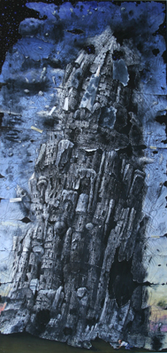
Local abstract artist Syau-Cheng Lai is having a good year. For a week back in early February, her mixed-media on paper installation Visualizing for Bunita Marcus spanned the walls of Cornell’s Olive Tjaden gallery. Executed on four long sheets with a bewildering array of drawing and painting media, it was pinned directly to the wall. It effectively interwove moments of sparseness with those of almost dizzying density. It was a definite highlight for local art. Lai is also a noted pianist. Accompanying the installation was her performance of modernist composer Morton Feldman’s solo piano piece For Bunita Marcus.
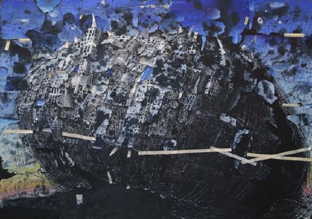
Currently on view at the Upstairs Gallery is a selection of smaller, framed work by Lai. Its an impressive body of work, although nothing quite matches up to her Tjaden installation. In particular, I miss the interplay between its epic length and the close-up intimacy of her mark-making. Nevertheless, their combination of exoticism, playfullness, and rigor is exemplary. Characteristically, most feature a dense layering of eclectic textures—drawn, painted and even carved. A few are more minimal. She is joined by out of town ceramicist Ann Johnston Miller. Although not as diverse or quite as compelling, Miller’s work betrays a compatible fascination with her materials.
Evocative of Visualizing—albeit on a much more compact scale—are a series of thin, scroll-like pieces. Due in part perhaps to this compactness, their quality is somewhat uneven. Hung either in an upright, vertical manner or horizontally, they are matted so as to expose the rough edges of the paper sheets. Like the Tjaden piece, looking at these pieces can be akin to reading or listening to music, with a definite if not overpowering feeling of linear sequence.
An upright Shattering Sky features a mottled background of gold and dark brown. Hanging from the upper-right corner are wavy strands suggesting knotted rope or hair. These have been forcefully carved into the paper, revealing white below. In the lower right corner sits a jumble of hard-edged shapes reminiscent of the Louise Nevelson’s wood-scrap assemblages – although not for its wide range of hues. Standing beside Sky is Before Sunset. Divided into an intricate arrangement of wavery Klee-like horizontal and vertical bands, the predominantly red, yellow and blue piece has a textile-like quality. Pieces like Upload, Ski Jump and Watermill combine paper-white backgrounds with tighter, more rigidly geometric lines and shapes. These seem overly fussy, as if the artist was trying to make too much happen.
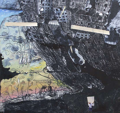
Lai’s smaller, more conventionally proportioned pieces have a more immediate impact. They compensate for their lack of breadth with their intensive layering. Her backgrounds are predominantly white, black, gray, red, pink, or gold over-painted with dark brown (the latter are scratched into revealing the color beneath). She often uses vertical and/or horizontal bands—hard edged or soft, thick or thin, visibly layered or opaque—to break up her compositions. Recurring motifs include illegible cursive script (running up and down in columns), Cy Twombly-like scribbles and erasures, dots and dashes, and suggestions of landscape elements such as horizon lines, waves, boats and crescent moons.
Deep Spring is particularly successful. Its horizontal bands of white, greenish yellow, warm brown and red have been extensively worked over with drawn and carved scrawls and loops, small impasto dashes and a blue arrow pointing offstage to the left.
Most of Johnston Miller’s pieces combine ceramic vessels with attached nest-like enclosures of grapevine (or in the case of Goddess Eye 3, copper wire). In Transformation, a smooth shiny orb glazed light green is placed inside the opening of a larger matte black blob. The small sphere is insulated with cattail seeds. Drawing – In and Open – Out are simpler: They are light green spheres in their vine enclosures. The long ceramic piece in Natural Dilemma resembles a rounded loaf of bread, right down to its toasted-looking brown color and rough texture.
Also by Miller are two parent and child pieces: the wide, plateau-like Cantilevered Form and the smaller squarish Cantilevered Bud Vase. Similar to Dilemma in color and texture, each has a outline echoing hole in the center. Bud Vase is so named for the smooth light green vessel nested smugly inside.


