Posted by Hanneke van Oosterhout on October 7th, 2007
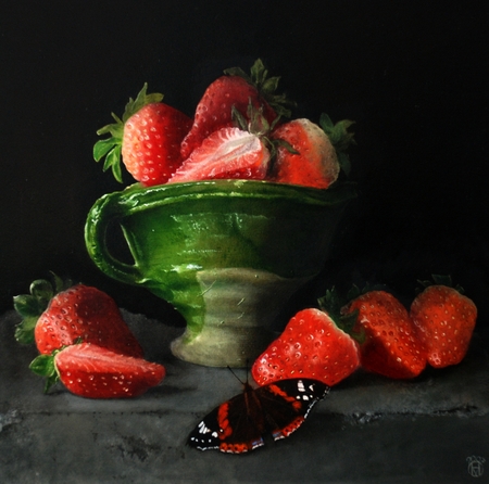
This is a new painting. Karl was against the idea that I should paint a butterfly in a still life, he thought it would be the essence of kitsch. When he saw the result, though, he thought it was good. What do you think, does the butterfly work here?
Are there some topics in art that are going to be kitsch no matter what, or is it really more a question of how the artist handles the topic?
Posted by Hanneke van Oosterhout on October 1st, 2007
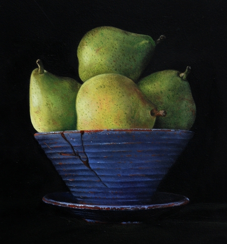
Here is a still life that I started over a year ago. It was originally not so good, but I made some changes and now I like it a lot. What do you think, did I improve it?
For me the lesson is that paintings that seem to not work so well may be a few strokes away from something good.
Posted by Hanneke van Oosterhout on September 24th, 2007
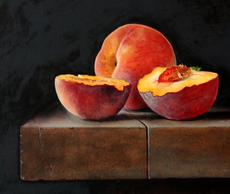
I’ve been doing a lot of painting and now I am preparing a website for the images. Here is one that was photographed today. Comments?
Posted by Hanneke van Oosterhout on February 10th, 2007
Posted by Karl Zipser
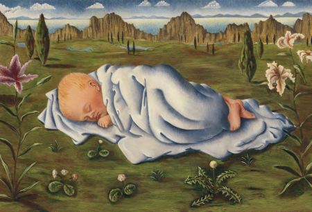
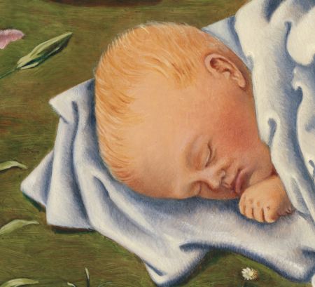
Hanneke can’t post today, so I am going to post about her work instead. Here is a detail from a painting. Can you guess what this is?
Hanneke has diverse talents. She makes both still life paintings and paintings like this one. The question is, what should Hanneke focus on? It’s a question we discuss from time to time. Hanneke paints still life because she loves still life. Ironically, still life, which in some ways is marketable, may be standing in the way of her making art that could get her more recognition. Should Hanneke paint “challenging art“, artworks speaking to terrorism, racism and other -isms of our time? Or is humble still life the real challenging art of our time, something which no serious avant-guard collector or dealer would dare to exhibit?
I’d be curious to hear what you think. Terrorism and social ills are not really Hanneke’s thing, but perhaps she should be practical and make less acceptable paintings. What do you say?
And don’t forget to look at the rest of this image… more… »
Posted by Hanneke van Oosterhout on January 27th, 2007
This painting of Françesca I made when pregnant with Nino (Fran was one year old then). We were living in Germany and I painted only an hour or two each day because I was too tired to sit longer (I was really big at that point).
It is based on drawings of Françesca sleeping, combined with my imagination. I find it wonderful to paint people.
Before I committed myself to still life painting I was working together with Karl using his rediscovered techniques of the old masters.
That is how I learned to use the different layers of paint in a simple and logical way.
I used to paint from my imagination, now I seem to have left that behind. How do you balance between reality and fantasy in your work?
. . .
more… »
Posted by Hanneke van Oosterhout on January 25th, 2007
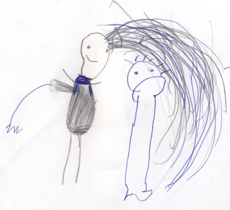
drawing by Françesca at age 3
I wanted to do a post about the drawings that my children made. I have an incredible amount of them (drawings, that is, plus five kids). The first thing was to choose and scan and crop and choose and scan and crop. more… »
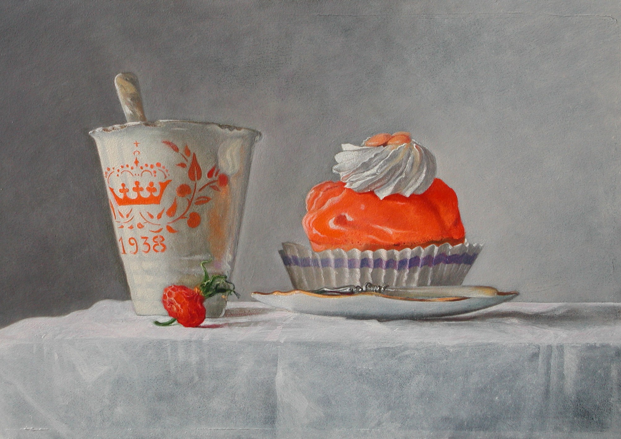
Posted by Hanneke van Oosterhout on January 20th, 2007
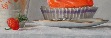
This is what I call my “Queens day” picture. It is of a very old cup that was given out when a Dutch princess was born, and of a pastry desert that you can only buy on the queen’s birthday. I wanted to do something with this very old cup and this thing you can eat on this special day because I found it such a challenging combination. Also, a painting in which the color orange is the head character is a challenge because it is not an easy color to paint with, and maybe not an easy color to look at. The House of Orange is the Dutch royal family.
This picture is not about primary colors, I think.
There are more interesting painting challenges in this picture. For example, mother of pearl in the handle of the spoon and fork. Here is a 640 KB version of the image if you would like to take a closer look.
What do you think about the composition? Could it be improved by cropping, or is it about right?
