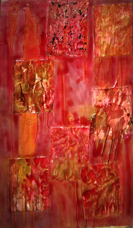
Posted by Jay on November 24th, 2012
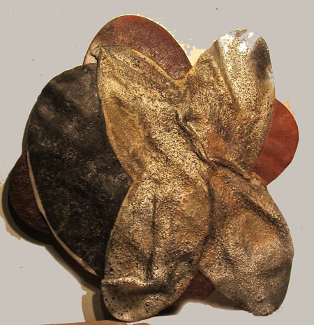
It started out as a place to dry dipped sheets of paper. But the Foamula surface began to take on a life of its own. At first I contented myself with applying a mixture of gold paint and varnish in an effort to glue the whole thing together. After awhile it began to come across as needing something more. I’m trying to wean myself of an addiction to puddled and shiny surfaces – but just this one time…
So, in the spirit of the season I got out some more varnish, mixed in some crimson and sploshed away. This is the first version.
And this is the seasonal development.
Posted by Jay on November 14th, 2012
The chain motif that appears in other posts here, continues to occupy me.
In this instance I am attempting to develop an idea of racial entanglement that goes back to one of my first inspirations for this series. The work in question is a piece of airport art from Kenya that constitutes a chain, carved from a single log, and featuring a head at each end. In fact, I took a swipe at making a version of such consisting of two ceramic heads, one negro and the other white, connected by an arbitrarily long steel chain. This chain, many tens of feet in length and rusted and worn, was to be draped over a remotely high and obscure support. The heads were to be at the same height from the floor and so arranged that they might collide with each other. I didn’t feel able to bring this off and the project pends.
Along similar lines is this: two separate and separately colored chains which follow their own trajectories, yet cross and entangle with each other.
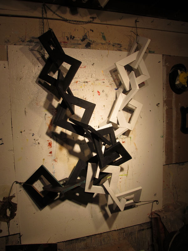
The rule is to not show an unfinished project, but in this case I’m making an exception. This because I’m looking for comment. For instance, does the layout say anything? How about the links?
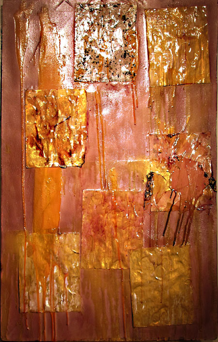
Posted by Jay on April 27th, 2012
” If I don’t want to exhibit the thing and if it cannot be re-used or improved, then I will throw it away.” Words to cull by.
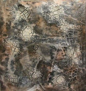
Out of the corners have come some pieces of ill-used Foamula that have caused me to ask: “What was I thinking?’. However they often still possess a pink reverso, open to a further assault. This new onslaught upon the as-yet unslaught upon seeks to answer some questions regarding the application of polyurethane varnish. Before, this varnish was apt to dissolve the Foamula and required a preliminary coat of water-based primer or paint on the surface to prevent that from happening. Since then, the composition of the varnish – at least the stuff I’m using – has changed. Unfortunately the new formulation is of a brownish color and more expensive. Fortunately it now appears not to dissolve the Foamula any longer. The old veteran boards are being pressed into service to see if this is truly so.
A design was drawn on the surface of this board and areas were blocked out with gesso, leaving the rest of the area bare. I then applied a hot air gun – the type used for removing paint. This caused the bare surface to shrink while the portions protected by the gesso remained relatively unaffected. I then tinted some varnish and spread it over the surface. It collected in the grooves and indentations with results that you can see. So far there have been no untoward effects.
more… »
Posted by Jay on January 21st, 2012
Nice weather, a substantial amount of basic material, a collection of experimental artifacts and a weed burner led to these objects. It boils down to the discovery that, sufficiently heated, acrylic plastic will deform and and fuse together, one item to another.
In this instance I had some acrylic cutouts for a project that wasn’t working out. I melted them together with the result that a draped effect emerged with an enrichment of colors and surfaces. Roughly three feet across.
more… »
Posted by Jay on November 11th, 2011
It seems that I am the only person who wants to use this utility. Allow me, then, to add a few more things that I have been working on.
One might refer to these items as baked goods as they represent the application of fire to one form or another of plastic. The first image began as a sheet of expanded polystyrene that was scored with a knife and scorched with a propane weed burner. This process opened the score lines and created checkered patterns which guided my application of paint and varnish.
more… »
Posted by Jay on August 3rd, 2011
I am trying this summer to simplify my productive activities without too much success.
I’m swimming in notions about how to create visual effects, whereas I should be advancing messages. The kit is there, now for more of a narrative.
On the one hand the chandeliers are happy being themselves: it’s the paint application technique that I’ve come up with that’s causing trouble. It produces results easily but, for now somewhat too randomly. I’m trying to harness it’s propensity for doing its own thing by finding things for it to do. Things that tend to be rendered in stone is one approach that I am playing with.
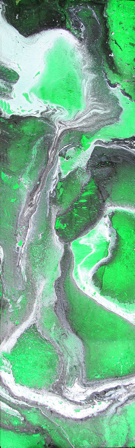
In this instance I have used black, white and green paint. The result I’m getting reminds me of sections of metamorphic rock. The technique is simple, but I’ll leave it to you to guess how it’s done.
more… »
Posted by Jay on June 30th, 2011
These are some pending objects.
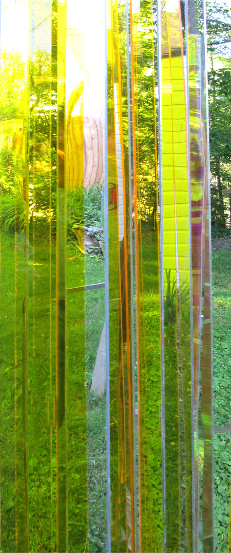
I have been working on plastic chandeliers for the last while. This is a close up of one composed of clear yellow acrylic and mirrored rhombs. more… »