Posted by Tree Smith on June 21st, 2010
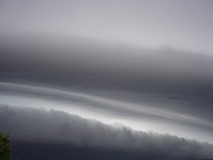
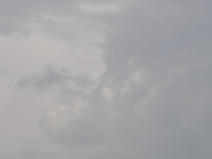
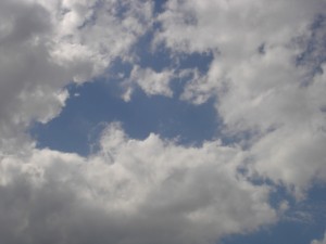
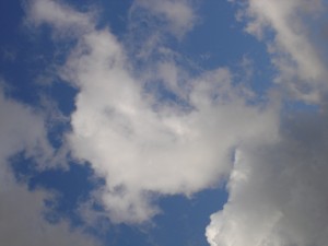
I thought it would be nice to share some photos of the sky on the one day of the year when we have the most time to look at it.
I took a series of photos of the sky over a period of about three months quite some time ago and I hope to return to the subject again one day. I would love to see these printed large and on a wall for people to get lost in.
How many of us look to the sky for a message of some sort? Happy Solstice.


Posted by June Underwood on June 8th, 2007
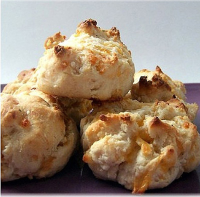
In a small art group that Jer and I belong to, we were given a challenge: for the next meeting, we were each to create some form of art based on “biscuits.” That meeting will be next week. I have to make some art. Using “biscuits” I came up with an anagram: “is Cubist.” I will make a Cubist-style painting, containing biscuits.
I thought the exercise would be simple. I would look at some Cubist works, get a couple books from the library and raid my bookshelves to see what others had to say, decide on motifs beyond the biscuits, and do a few sketches. Then, I would be ready to paint. more… »
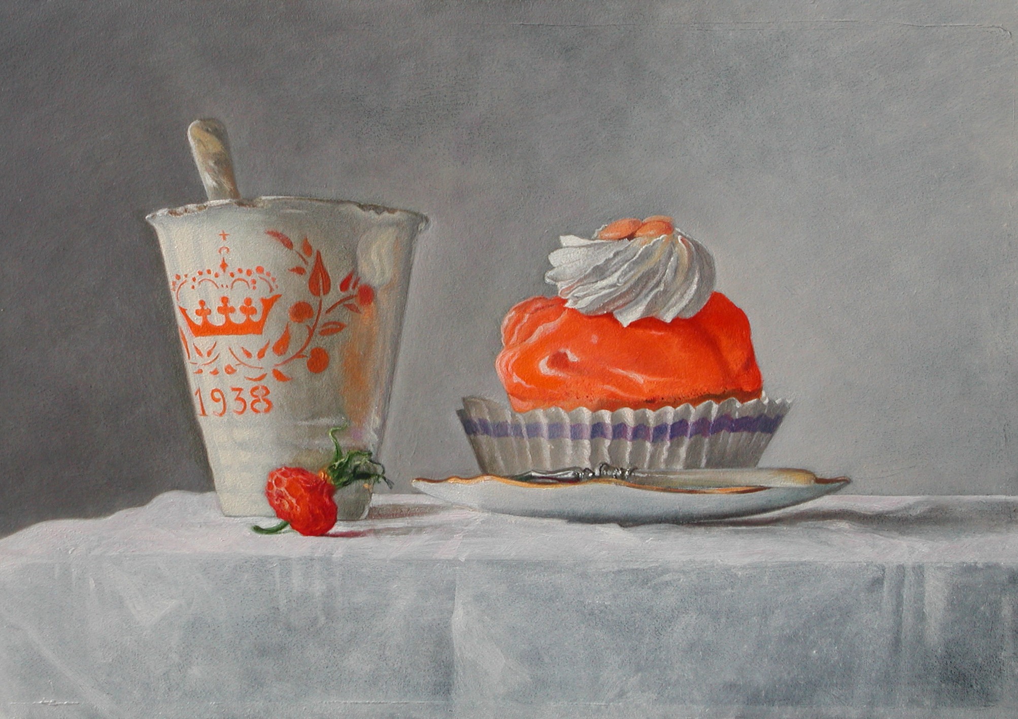
Posted by Hanneke van Oosterhout on January 20th, 2007
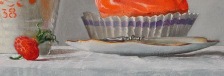
This is what I call my “Queens day” picture. It is of a very old cup that was given out when a Dutch princess was born, and of a pastry desert that you can only buy on the queen’s birthday. I wanted to do something with this very old cup and this thing you can eat on this special day because I found it such a challenging combination. Also, a painting in which the color orange is the head character is a challenge because it is not an easy color to paint with, and maybe not an easy color to look at. The House of Orange is the Dutch royal family.
This picture is not about primary colors, I think.
There are more interesting painting challenges in this picture. For example, mother of pearl in the handle of the spoon and fork. Here is a 640 KB version of the image if you would like to take a closer look.
What do you think about the composition? Could it be improved by cropping, or is it about right?

Posted by Hanneke van Oosterhout on January 17th, 2007
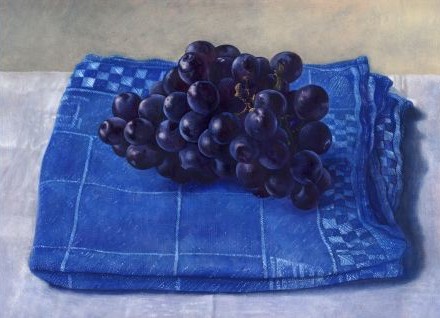
I’ve gone further with this painting (which we saw at earlier stages before). I’ve been thinking a lot about your suggestions from last time while I was painting. What do I need to do to finish the picture? Any suggestions? For reference, the cloth is about 25 cm wide at its widest point. Here are some details of the picture: more… »
Posted by Hanneke van Oosterhout on January 13th, 2007
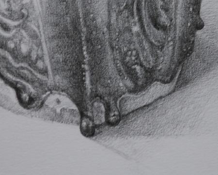
Here are the drawings I have been working on in the new year.
more… »
Posted by Karl Zipser on January 10th, 2007
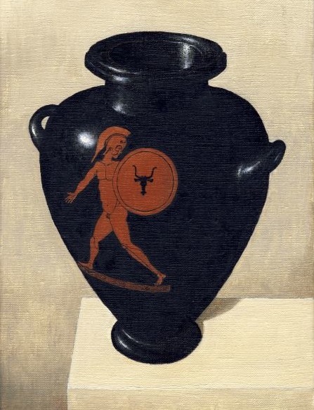
Who is the most influential art blogger? Ed Winkleman, of course. I haven’t been following his blog as closely as I would like to, but yesterday I took a look and the title of his recent post Art About Art got me excited. I’ve been working on an essay about this general subject “art about art”, and I wondered if I had been scooped. In fact, there was no connection; Winkleman’s post could have been titled “Art about making art,” how artwork depicting artists “caught in the act” of creation tells us about how artists did what they did. In my own experience this is a fruitful avenue for research, because there is much to be learned about studio practice from old paintings, (how to store brushes in linseed oil, for example, or how the palette was laid out in the 15th century). There is also much to learn from ancient art about the making, painting, and firing of ancient Greek ceramics.
Back to art about art — the concept of depicting art in art opens a lot of possibilities. The imaginary vase painting still life above is an example. I have long been fascinated by Athenian vase painting because of the potential of the vase to act as a “frame” for drawings and paintings on the vase itself. This fascination led me to a long love affair with ceramics and kiln building — that’s for another time though. The painting above is a technical study in how to paint a representation of a vase with oil colors on canvas. The form of the vase is based on studies of a stamnos in a museum in nearby Leiden, while the “red figure painting” is based on a painting on an amphora in the same museum. I studied these ancient objects by drawing in my sketchbook at the museum, then created this fantasy synthesis in my studio.
In fact, I worked out the rough form of the vase together with Hanneke van Oosterhout in a large painting we did together. I made this study to develop the technique for painting the vase before overpainting it in the large painting.
Every blog post should end with a question, right? Okay then, what do you think about Ed Winkleman’s blog? Or, what do you think about “art about art”? Or, what do you think of collaborating on artwork?
…
related post: Art about art and doing a 180
Posted by Hanneke van Oosterhout on January 6th, 2007
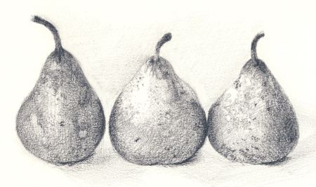
I decided to start drawing again on a serious basis and I today I wanted to try to capture the texture of these pears. I wanted to see if I could make come out in the drawing the complicated texture these pears have. I think got some of the feeling of these slightly shrunken and beaten up pears. The challenge is to capture that without paint. I wanted to see if something that I could paint I could also do it in pencil.